Tag Archives: design

Solarpunk and Cars

pexels-photo-12508039.jpeg
Photo by Carlos Lopez on Pexels.com

Solarpunk walks the middle path between technosolutionism and anarcho-primitivism, so while #bancars has a nice ring to it, I lean more toward using cars where they make sense, but not treating them as the proverbial hammer to the nails of all societal problems like 20th Century urban planners did here in the US.

We’ve explored some of the issues with car-centric design here before, and if you want to explore it further, I highly recommend Not Just Bikes for video or The War on Cars if you prefer podcasts, but suffice it to say that designing the environment around the automobile has had significant deleterious effects on both the natural world and society.

Tesla’s recent robotaxi unveiling had this quote, which I found interesting. [via Stratechery]

When you drive around a city, or the car drive you around the city, you see that there’s a lot of parking lots. There’s parking lots everywhere. There are parking garages. So what would happen if you have an autonomous world is that you can now turn parking lots into parks…there’s a lot of opportunity to create greenspace in the cities that we live in.

As usual, techbros are able to see a problem but really miss on executing a solution because they are hampered by the profit motive of late-stage capitalism. You know what else makes parking lots obsolete and already exists? Density and public transit.

sao paulo subway station with train and passengers
Photo by Joel Alencar on Pexels.com

City living that is now the dominant way people live, which is the ideal use case for public transit coupled with electric micromobility like e-scooters and e-bikes. Densification with things like superblocks makes life easier and can improve human happiness, especially when we’re also weaving in the natural world to our built environment through ecological density.

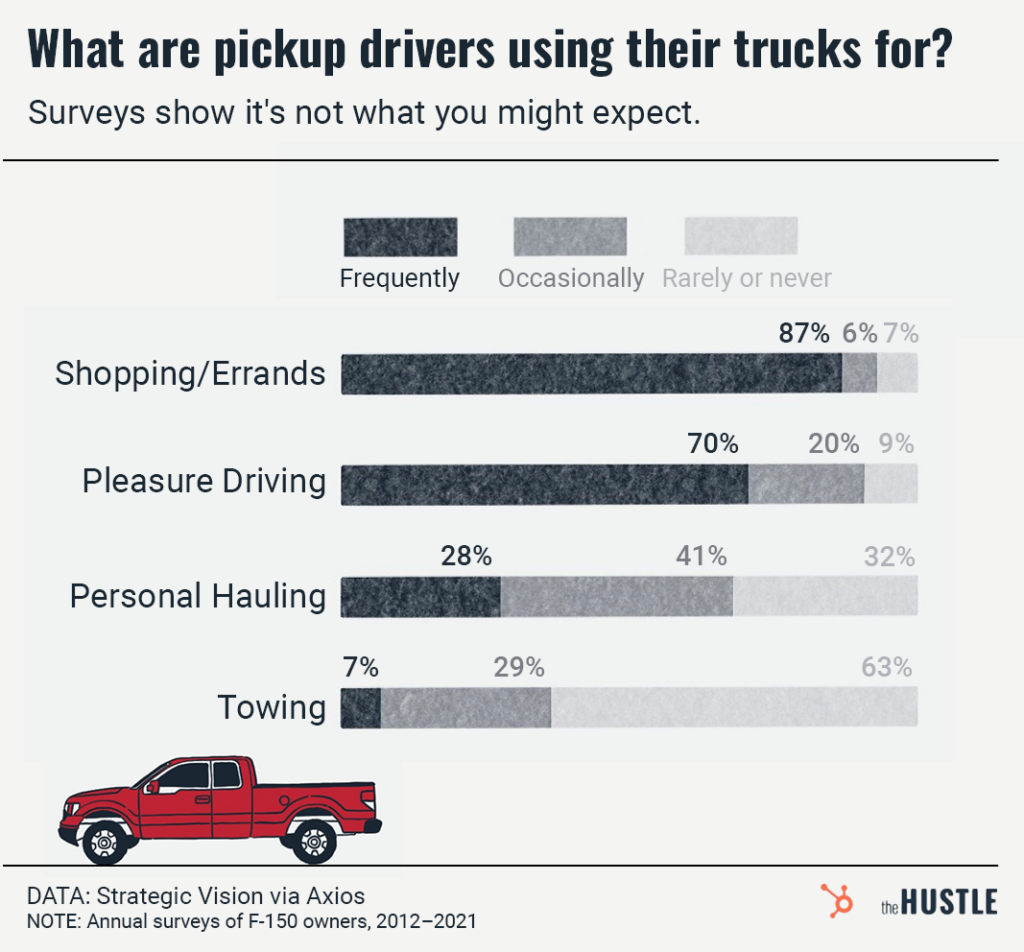
The vehicles we do have in a solarpunk future won’t look like the dominant species on the road here in the US today, the giant pickup. Trucks have gotten heavier, less capable, and more deadly to pedestrians than their forebears. This all happened while people are less likely to use their trucks for truck stuff.
Even if you assume that all the trucks on the road now are necessary, surely you don’t need a 3,000 kg (6,500 lb) vehicle to do it? Kei trucks have been doing truck stuff for years in a much smaller package, and now there’s an EV truck on the horizon that will do truck stuff in something the size of a Mini: Telo. The Telo MT1 has a folding midgate like the Avalanche of yore giving it a full 8′ bed as well as the ability to fit five to eight passengers inside depending on if you put the bed cap on the back.
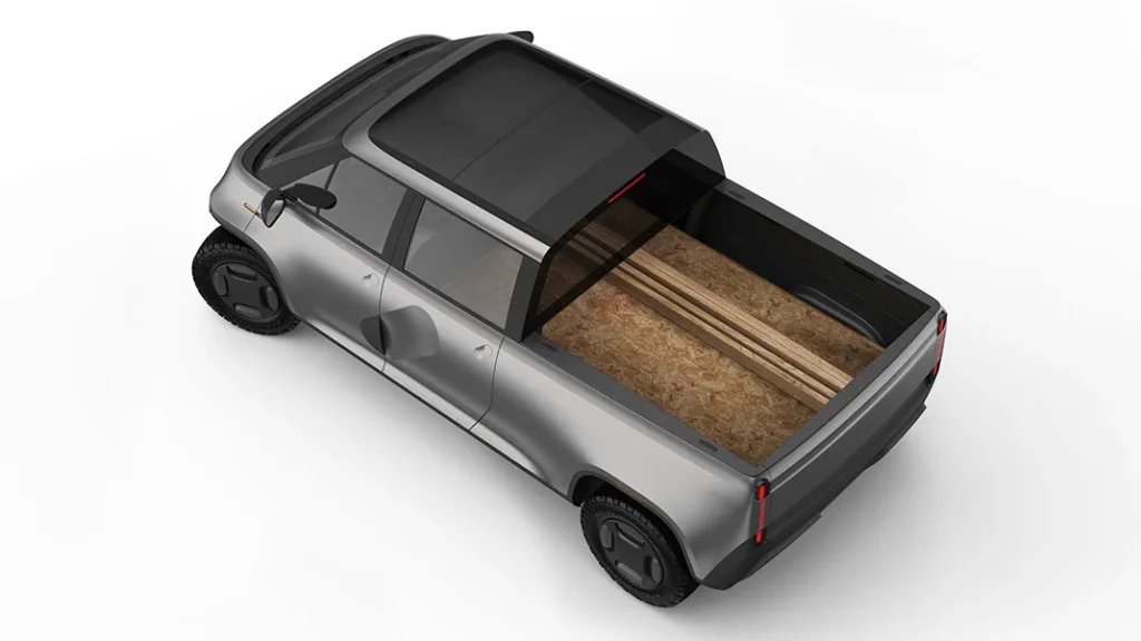
An image of a truck approximately the size of a Mini cooper. A sheet of plywood extends under the rear window and into the back seats.

I’m particularly excited about Telo since while I don’t want a truck, there’s also a van version planned as a second model. We’ve gone from a one car family to two after our move due to my wife’s work being inaccessible via any means but driving. We had a rental minivan while her car was in the shop, and the sliding doors were awesome with a toddler, but it was anything but mini in size.
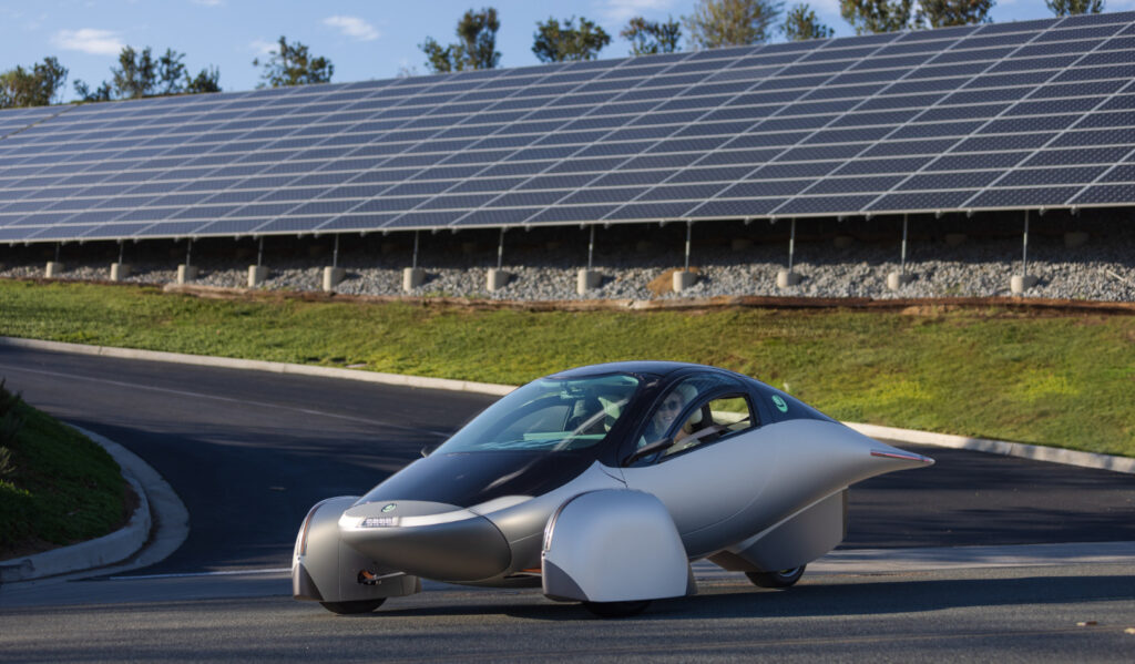
An aerodynamic three wheeled vehicle sits on blacktop in front of a solar array. The car has a white middle, silver nose, and black top and hood. The array is on a hill with grass at the bottom.

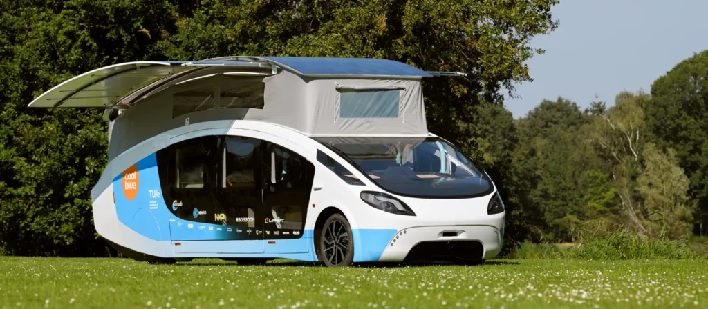
A vehicle which has had a few ups and downs getting to production is the Aptera. Obviously based on a lot of the techniques we used building solar cars for student design challenges, the Aptera takes efficiency to the extreme to make a vehicle that can actually get an appreciable amount of range from just the solar panels on it. I still think stationary panels on a building make more sense in general, but vehicles like it and the Stella Vita show what could be possible when small efficient vehicles are the norm.
Those of you overseas might not understand what the fuss is about since you already have small EVs like the Hyundai Inster available which packs a ton of space into a small footprint. It can’t haul plywood, but it would fulfill 90% of the needs of most people, especially once you factor in the increased density of cities and availability of public transit and high speed rail in a solarpunk future. I imagine a few small shared vehicles in a neighborhood for those times when you need a personal vehicle, but otherwise you’d be walking, biking, or taking transit to get around.

I grew up restoring classic cars and going to car shows, so I’ll admit I’m biased to say I don’t think cars will totally go away in a solarpunk future. EVs are a necessary, but not sufficient part of addressing the climate crisis. As some advocates say, EVs are here to save the auto industry, not the planet. We need fewer personal vehicles and big roads, and the shared vehicles we have should look more like the Telo, Inster, Aptera or even the robotaxi instead of a Hummer EV.

What do you think? Am I just too set in my thinking to imagine a world without cars, or are there some use cases where a car is the right tool for the job?

Happy New Year?

letter tiles beside mandarins
Photo by Anna Tarazevich on Pexels.com

Is it almost February already? Well, Happy New Year anyway! Hope things are off to a decent start for you all, and if not, I hope they improve soon.

I have several updates to post. First of all, last summer, our family moved from Charlottesville, VA to the Augusta, GA area, so I hope that goes some way toward explaining the dearth of posts from me in the last year. A big thank you goes out to all the guest bloggers who have been sharing their thoughts on Solarpunk Spirituality over the last year and helping me keep things running here. We will hopefully have one more post in the series before we call it to a close. Be sure to let us know what you think about it all and whether we should do another guest blog series on other topics in solarpunk!

A few podcasts have dropped in the last few months featuring me. Most recently, I was interviewed by Ariel at Solarpunk Presents about the Solarpunk Spirituality Series. In December, I was on two more episodes of If This Goes on Don’t Panic: another episode of my book review column Book Navigator and a solarpunk panel Q&A with Justine Norton-Kertson, Susan Kaye Quinn, Alan Bailey, and myself to wrap up the year of solarpunk columns over there.

I also have a piece about designing Heirloom Devices in the Solarpunk Conference Journal that was just published (for free!). Go check that out if you’re interested on my take on how to design devices that better fit into a solarpunk future. This is really a continuation of my thoughts from the Solarpunk Phone Series I wrote a few years back.

How was 2023 for you? Do you have any solarpunk plans for 2024? Let us know below!

Hundred Rabbits – Real Life Tidalpunks

Two humans wearing rabbit masks complete with large ears stand on a rocky outcrop with barren trees and a vast sky in the background. There are mountains in the background as well with cumulus clouds above.
The Rabbits

You may have noticed that I’m somewhat obsessed with tidalpunk around here, but since I hadn’t even seen the ocean until I was in my 20s, I’m probably not the best person for advice about how to actually be a tidalpunk. This is where you would be better served by the artist collective, Hundred Rabbits.

Hundred Rabbits is an ocean-faring duo writing energy efficient software and finding ways to better mesh life on a sailboat with tech work. They’ve documented much of what they’ve learned on subjects like living off grid, why they’ve developed their own software tools, and how you can shop for your very own sailboat to live the tidalpunk life.

We talk a lot about keeping gadgets going longer and designing them for repairability here, and Hundred Rabbits are living that out in a much more extreme environment than we have here in central Virginia. According to their stated philosophy, “We target 20 years old hardware as to encourage recyclism and discourage the consumption of fashionable electronics.” They’re really hitting the Reduce and Reuse parts of Reduce, Reuse, Recycle. The fact they also use a 2010 MacBook Pro as one of their main machines makes me even more excited to have been introduced to their work.

Are there any other tidalpunks out there that you’ve run across? Are you going to buy a boat and join them yourself? Let us know in the comments!


If you’d like to help the blog, please share our work or consider supporting us on Comradery, a cooperatively-owned patronage platform.

Rocking a Pebble in 2020

My beausage-rich Pebble smartwatch

I’ve mentioned before how my Pebble smartwatch is one of my favorite devices, but I thought I’d detail how the device is helping my sanity in 2020, four years after Pebble company shut down.

Pebble was one of the first successful smartwatches, and raised $10M on Kickstarter, making it the most successful crowdfunding campaign to date when it closed in 2012. Watches started shipping in 2013, and even seven years later, the Pebble is one of the best smartwatches available.

In 2017, I joined the smartwatch crowd with a used, original Pebble. Smartwatches aren’t a required part of modern society, but my Pebble lets me triage incoming smartphone notifications and send simple replies. I set my phone to silent and receive a gentle vibration on my wrist whenever a notification comes in for one of the apps I’ve allowed to notify me. When I unlock my phone later, I can see any low priority notifications, but I really enjoy not having the mental clutter of seeing or hearing every single notification as it comes in. My Pebble makes my smartphone experience significantly more pleasant and offers me a small bit of mental clarity I wouldn’t get otherwise.

Earlier this year, my Pebble had started dropping it’s connection to my phone and experiencing some strange issues. Afraid it was dying, I put it in airplane mode and used it as a regular watch for a couple months. After digging around online, I decided the most likely culprit was the battery, so I ordered a replacement. Then, I kept using the Pebble as a regular watch for another month since I was so intimidated about cracking it open to replace the battery.

Internals of a first generation Pebble smartwatch

I eventually worked up the courage to do the battery replacement, and I am so glad I did. I’d forgotten how much calmer my mind feels without the incessant chimes and dings of my phone’s notification system. The new battery is slightly bigger so the watch back isn’t flush anymore which hampers its water resistance, and I cracked the backlight guide which gives a slight line down the middle of the display, but I’m just going to call that beausage and move on. It’s only visible when the backlight is on anyway, so it’s exceedingly minor.

One downside of having a watch from a defunct company is that not all of the watch apps work anymore. Luckily, the back end for many services is now maintained by the Rebble community, so if you have a fancy newer Pebble Time, you can still use voice dictation, and the app store is still there even if not all the apps work 100% anymore.

The Pebble isn’t perfect by any means, but a smartwatch that still works seven years after its debut seems pretty solarpunk to me. When Android Wear and Apple watches get relegated to obsolescence by Google and Apple, Pebbles will still be telling time and making life subtly better. Like any electronic device, I can see where the watch may eventually break down, but I’ll probably try to find another Pebble unless someone comes out with a similarly simple smartwatch. I would suggest upgrading to the Pebble Steel though since the plastic casing seems to be the most fragile part of the whole watch.

Do you think smartwatches are an unnecessary extravagance, or something that can help deal with information overload? Let us know in the comments!

Indistinguishable from magic

cody block

CODY BLOCK Learning Toy

Last year, I wrote a little about how solarpunk design could lead to better gadgets. One of my personal design goals is that things should feel magical, not in the way marketing agencies apply the term to everything, but rather that a piece of technology should disappear in use. It should help you accomplish whatever it was that it was designed to do, and not steal the spotlight for itself. Algae-based path lighting in a lunarpunk community or a sailboat in a tidalpunk town come to mind.

I was on Kickstarter last night, and found the CODY Block project, and immediately felt like it was something that fulfilled this objective. The toy uses RFID and robotics technologies in a way that teaches simple algorithmic thinking skills while not requiring any screens or interaction other than playing with blocks (and presumably an occasional top off of the battery). I encourage you to watch the video over at their Kickstarter, as there’s a certain je ne sais quoi to the blocks that I can’t adequately describe through text.

A wooden car navigates a series of directional blocks.

I’m not affiliated with them and would suggest caution since so many Kickstarters end up flaming out, but I think that the product design team at QUBS seems to really get how to make technology sufficiently advanced to become indistinguishable from magic.

Nintendo has also partnered with LEGO to create an interactive Mario set that elicits a similar feel. It feels a little less magical to me, but I think it’s another step in the right direction. I don’t think all toys should be sensorized, but having those that are more closely imitate the real instead of the digital seems heartening.

Mario time

The Nintendo and LEGO collaboration lets people play “levels” in the real world

Is there anything you’ve run across that feels truly magical? Am I just delusional from cabin fever and this isn’t that cool? Let us know in the comments!

Cities as ecosystems

With the start of the new Comprehensive Plan here in Charlottesville, I’ve been thinking a lot about the big picture of the city. I’ve been involved with bicycle advocacy here in town for awhile now, and I’ve felt that was definitely something worth fighting for since cycling, walking, and other active forms of transportation benefit both the environment and human health. Also, when you look at bicycling in the US, you have a bimodal distribution of users — people who have to cycle and people who choose to ride. Bike advocates have traditionally been from the latter group due to middle class people having more spare time to be active in local politics.

Charlottesville City Zoning Map (c. 2009)

The more I’ve worked in transportation, the more I see that we need to seek synergies when fighting for equitable, sustainable, solarpunk futures. Poverty and homelessness are often portrayed as the fault of the poor, the result of laziness or bad luck. The truth is that the systems built into our society and built environment put up barriers to certain groups of people that are easy to overlook from a privileged perspective. How can we start to see things as systems, and not a collection of isolated parts?

We have a template to draw from in nature. In a natural ecosystem, there is no waste, just an endless flow of energy and material from one organism to the next. What if we started to look at our cities as ecosystems? How could we build synergistic effects between parts of our built environment?

13714826875_1c9fed839b_k
Garden courtesy of cuprikorn

Take a city park as an example. In traditional design, you’d select a plot of land, stick some trees and grass there, and call it a day. You might go so far as to add some playground equipment if you were putting it in a residential area.

Approaching a park from an ecosystem perspective, however, would allow for a much more vibrant community experience. We have a park here in Charlottesville that isn’t reaching its full potential because while it borders two different neighborhoods, a busy street separates one neighborhood from the park. Parents don’t feel safe crossing with their kids, so they don’t go to the park. If we took the whole ecosystem into account, safe crossing to and from the park would have been an integral part of its design. As discussed extensively in The Nature Fix, exposure to nature is immensely beneficial for mental and physical health. Poor design has a tangible, detrimental effect on equity.

Taking things a step further, the green space of parks also affords an opportunity to work on sustainability. Charlottesville is in the Chesapeake Bay Watershed and has an important role to play in reducing pollution that flows into the Bay. In addition, stormwater management is becoming an increasingly important aspect of urban design as climate change makes storms more variable and rainfall less predictable. As a way of integrating ecological density, we could add native plantings to encourage pollinators as well as rain gardens and permeable pavement for managing stormwater.

By taking some additional steps in the design phase of a project, we enhance the equity, sustainability, and beauty of the city all at once instead of requiring separate projects to achieve a less resilient and integrated design. The same approach could be used when approaching transportation or housing. Taking the system as a whole into account when making planning decisions will allow us to more carefully shepherd our resources and do the most good with our limited community resources.

What opportunities for ecological systems thinking are there in your area? Let us know below!

Credit Where It’s Due

Last year, I wrote a series of posts about mobile devices focused on repairability, decentralization, design, and user experience. One of my main complaints was how mobile devices had gone from a Cambrian explosion of form factors in the early 2000s to a monoculture of iPhone clones in the 2010s.

While I have plenty of issues with the business practices of tech giants, I would like to take a moment to give some credit to some companies actually experimenting again with form factor. A lot of this is likely due to the coming decline of smartphone and computer sales, but it’s nice to see some variety again.

surface-neo-reveal

The Microsoft Surface Neo

Dual screen Windows machines can trace a lineage back to the Toshiba Libretto W100 of 2010 and the Microsoft Courier concept before it. Various other half-baked attempts at dual screen laptops have peppered computing history, but it seems like a concerted effort from Microsoft’s Windows 10X will attempt to alleviate all the previous kludgy issues of dual screen computing. As someone who was devastated when the Courier was cancelled, I’m intrigued to see how well they pull it off. The Surface Neo and Lenovo Fold are two of the upcoming folio-esque devices that will use Windows 10X for true “notebook” computing.

Android efforts in the dual screen space date back to the Kyocera Echo from 2011, but the device didn’t really live up to most expectations, much like the aforementioned Libretto. Folding screens are coming to market in devices like the Samsung Fold and new dual screen devices like the Microsoft Surface Duo are experimenting with the phone/tablet hybrid form factor again. As with the Windows 10X system, I’m interested to see what comes of these new devices, but it is hard not to see them as a modest evolution over previous efforts. I suspect a lot will come down to what software engineers are able to do with the new capabilities of the hardware. If we just get wider versions of existing apps, it won’t be much to write home about.

A more exciting development, in my opinion, was Amazon unveiling two devices last fall that hearken back to the visions of wearable computing first pioneered by the MIT Media Lab and Steve Mann among many others. I talked briefly about personal area networks (PANs) last year, but basically, they decentralize the parts of your computing experience into several different devices, instead of a single glass slate. The capabilities of mobile hardware have progressed so much in the last 20 years that newer PANs should be nothing if not exciting.

Echo Frames

The Amazon Echo Frames are a more subtle way to interact with technology

Echo Frames may look like a Google Glass copycat at first, but they eschew the creepy camera and bulky screen in favor of glasses with a built-in Alexa voice assistant. Voice computing is an exciting area of research right now, and is particularly beneficial for the blind. The Echo Loop is a ring that performs voice assistant functions while living on your finger. I’m glad to see some experimentation with computing devices that don’t rely on screens for data input and output. It seems like a less distracting way to interact with our computers, but only time will tell.

MojoVision2

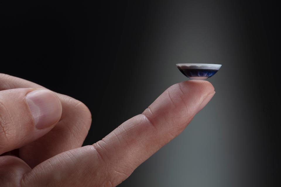
The MojoVision XR contact lens prototype

If you were disappointed by the lack of a screen in the Echo Lens, then maybe the Mojo Lens will be more to your liking. It looks like this will be the first “smart” contact lens, giving you an augmented view of the world without requiring some bulky hardware affixed to your head. While it isn’t as close to production as the previous examples, it does offer an interesting interpretation of bringing the magic back to computing.

Are you excited about one of these form factors? Is there a type of device you haven’t seen represented in the real world that would make your life better? Let us know below!


New Year, New Spool

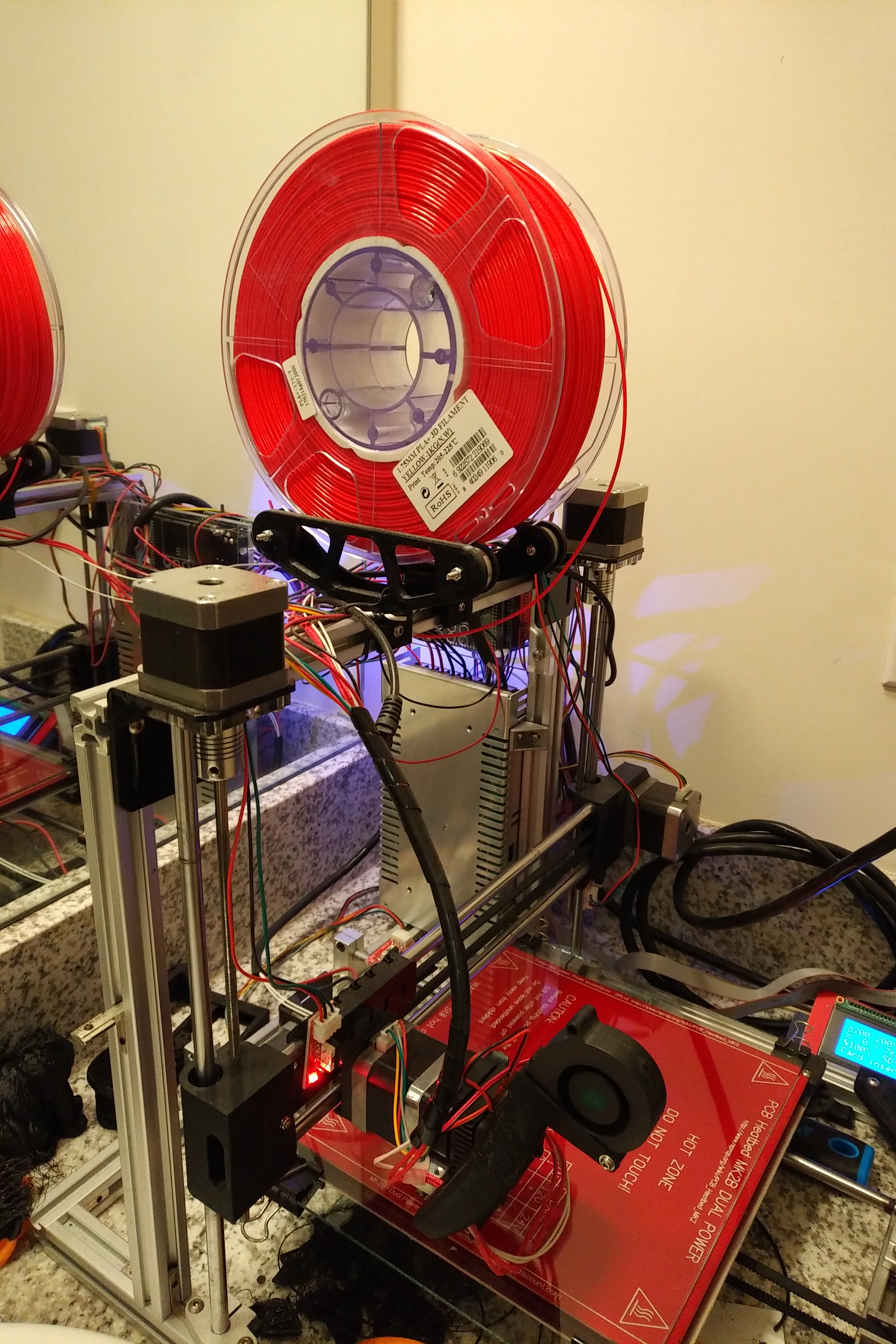
While 3D printing has the potential to decentralize product design and manufacturing, nothing is without it’s drawbacks. One of the biggest for 3D printing is the inherent waste of filament packaging. Filament typically comes vacuum-sealed on a plastic spool with a tiny silica gel packet. The plastic film and silica gel are there to prevent water uptake which can have a negative impact on filament performance, and the spool is there to provide the filament with structure and an easy way to keep the long strand of plastic from tangling.

IMG_20191214_0133240

My 3D printer with one of its new Master Spools mounted on top

The problem comes when you reach the end of the spool. What are you supposed to do with an empty spool? People on Thingiverse and the other 3D printer file repositories have come up with an impressive number of solutions to reusing these empty spools, but at some point, enough is enough. Luckily, makers are an inventive bunch, and RichRap came up with a solution called the Master Spool.

By making the spool a reusable part of the 3D printing process, filament is cheaper to ship with a reduced weight and carbon footprint. Since it’s an open standard, any filament manufacturer can jump onboard and offer their filament as Maker Spool refills. Master Spool is still new enough that only a few manufacturers are supporting it so far, but the speed of adoptions makes me think this will become the new normal for 3D printer filaments.

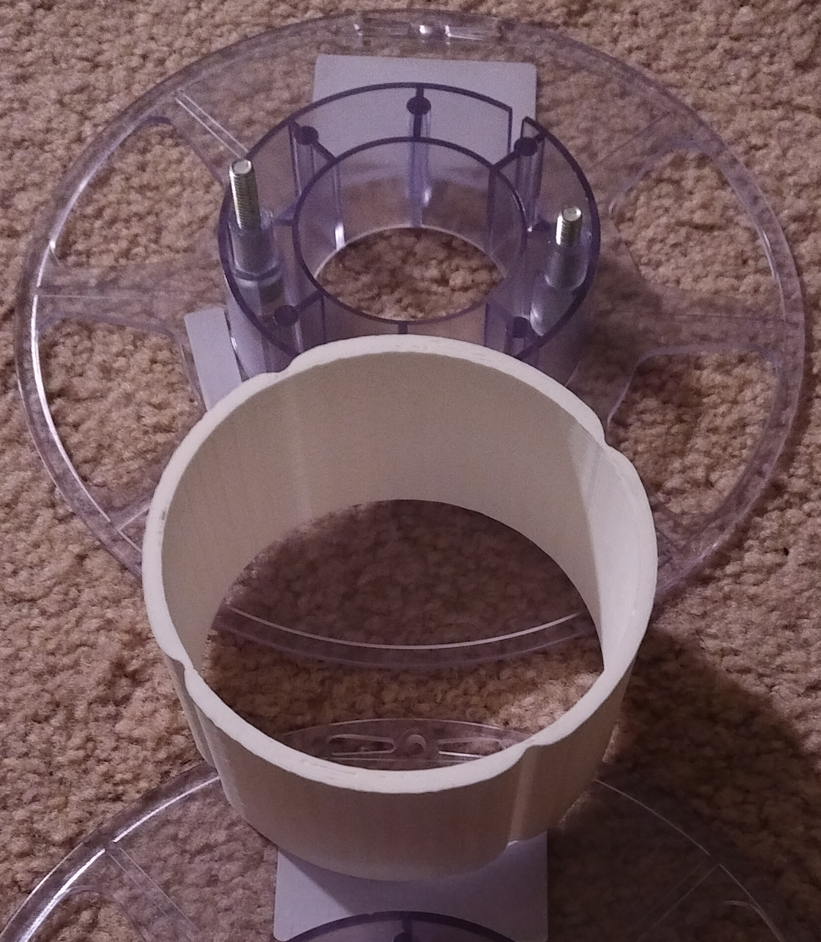
I ordered my Master Spools from Filastruder, and so far, I’m really impressed by the quality of the filament and how simple it was to put the Master Spool together. Two bolts and cutting three zip ties is all it takes to free yourself from an unending pile of empty filament spools.

IMG_20191214_0125409

The empty Master Spool

This system isn’t entirely without waste, but it’s a big improvement over what came before. The plastic film can probably be recycled with other plastic bags in your area (usually at grocery stores), but I’m not sure what to do with the zip ties other than throw them in the trash. I keep the silica gel and put it in with my filament to try keeping it dry, but if I were a manufacturer, I’d spend the little bit extra and spring for the reusable silica gel packets with color indicator to reduce waste even more.

I think this is still a win for making 3D printing more sustainable. What do you think? Let us know in the comments!

Recycling Rant – Mixed Materials

I know that recycling shouldn’t be our first line of defense to handle our waste streams, but it is something that can help divert materials from the landfill once they already have been created. But you wanna know what really grinds my gears? Mixed material food packaging. Sure, China’s National Sword cut a great big hole through US recycling efforts, but we can still recycle #1 and #2 plastics in most municipalities, and #5 if there’s a Whole Foods somewhere in your area.

If we want to encourage recycling though, we need it to be easy. People are busy, making their waste stream pretty low on their priority list. So, why on Earth would you make a dairy container out of #5 plastic and put a #2 lid on it? You took the time to make sure the two plastics looked identical for cohesive branding, but the only visual difference to the consumer is if they look at the little recycle triangle on BOTH parts of the package. Is this easy? NO! Store bought icing is even worse with its #5 or #2 body and #4 lid. Where the heck am I supposed to recycle a #4 that isn’t a plastic film like a bread bag?

man wearing teal long sleeved shirt

Photo by Anas Jawed on Pexels.com

As engineers, I know we want to find the optimal solution for every component of a design, but for single-use containers, end-of-life needs to be high on that priority list. I’m not a food packaging engineer, but my hierarchy of design would go something like safety/preservation of food, taste impact, mechanical stability, and end-of-life. I’ll grant you that you can’t package in something that will impact taste or safety, but is that #2 lid really making enough of a difference in your product that it’s worth confusing people so you get #2 and #5 plastics mixed up in each other waste streams?

If you ARE a food packaging engineer, I’m begging you to please consider end of life when designing your products. We are on a finite planet, and because plastic is such a useful material, I would really love it if we could easily reclaim it for future use. Whether it’s particularly safe for contact with food or whether we really need so much of it is a whole ‘nother ball of wax. For today, please think through your material choices and try to find ways to make recycling easier.

Moving toward a zero waste, solarpunk, circular economy is high on my wish list for the world, and there’s plenty of research that shows that unless you make something easier than the alternative, people just don’t have the bandwidth. The onus is on the designer, not the consumer for this. We can do better – please do!

Is there anything you’ve run across that was packaged ridiculously? Let us know below!

A Better Way to Pay

dollar-currency-money-us-dollar-47344.jpeg

Photo by Pixabay on Pexels.com

As Adam Flynn said back in 2014, solarpunk takes infrastructure as a form of resistance. One of the biggest pieces of infrastructure that people interact with on a daily basis is payment systems. Payments aren’t as visible roads, or as tangible as housing, but decentralized, democratic payments are an important part of ensuring a brighter future.

We’re at a turning point for money. Since the middle ages, money has been controlled by the nation-state through fiat currency. The first experiments with digital-first money started in the 1980s, and we have seen an explosion in the availability of cryptocurrencies since the Bitcoin whitepaper was released in 2009. While Bitcoin hasn’t lived up to its original goal of being a replacement for fiat currency, it did revolt against the idea that only the state can create money.

Nation-states are now looking into developing crypto-fiat hybrids, and large corporate actors like Facebook are developing their own cryptocurrencies as well. The additional pressure of countries considering bans on cryptocurrencies that shield user identities makes me feel that governments see the danger that a truly decentralized monetary system would pose to their monopoly on power.

Brett Scott at Roar wrote about gentrification of payments from centralized issuers, “Put bluntly, digital payment facilitates a vast new frontier of financial surveillance and control, while also exposing users to new risks not present in the cash infrastructure.” He points out that the current trend for countries to emphasize digital (fiat) money over cash puts people’s finances increasingly into the hands of a small number of banks and state actors.

four assorted cryptocurrency coins

Photo by Worldspectrum on Pexels.com

I’ve previously touched on the subject of designing appropriate incentives into a monetary system, but for now I’m going to focus on how true digital cash could work. Bitcoin is the opposite of private since every transaction ever made with Bitcoin is recorded to its public ledger. Privacy coins allow for transactions to remain private by being recorded to the blockchain with the details obfuscated to all but those who performed the transaction. This has major benefits, particularly for the fungibility of a currency, which is a fancy way of saying that every unit of the money is created equal. For completely public blockchains like Bitcoin, certain Bitcoins may become “stained” due to their use in criminal activities in the past, meaning they may become harder to trade or spend than a “clean” Bitcoin. There is no such distinction between the status of a specific unit of Monero, for instance, since its past is unknown. The MimbleWimble protocol is a new blockchain which greatly simplifies the privacy aspects of a blockchain resulting in less power and data consumption.

The problem with most cryptocurrencies right now, however, is that they typically use what is called Proof of Work to verify transactions on the chain. Proof of Work burns large amounts of energy in an effort to “prove” the validity of the blockchain. Various other schemes have been developed to secure blockchain networks including Proof of Stake, Delegated Proof of Stake, and Proof of Cooperation. Proof of Cooperation was developed for FairCoin to enable a less energy-intensive verification method for blockchains. I think that a Proof of Cooperation-based MimbleWimble coin could provide the privacy and lower energy consumption that would be desirable for digital cash.

business bank chip credit card

Photo by Dom J on Pexels.com

This digital cash would restore the peer-to-peer nature of cash and avoid the data-mining perils of current digital payment companies like Visa or PayPal. It is still dependent on computing technology to work, which makes me feel like it would be less inclusive than actual cash. In an increasingly digital-first world, however, thoughtfully-designed cryptocurrencies will be more inclusive than the options designed by corporations or governments. For more on the subject of post-capitalist money, check out In each other we trust: coining alternatives to capitalism by Jerome Roos.

Money is often considered a taboo subject, but feel free to let us know your thoughts below. How do you think a separation of money and state could be liberating?